

Early design and development of avatars for the Star+ service for Latin America.
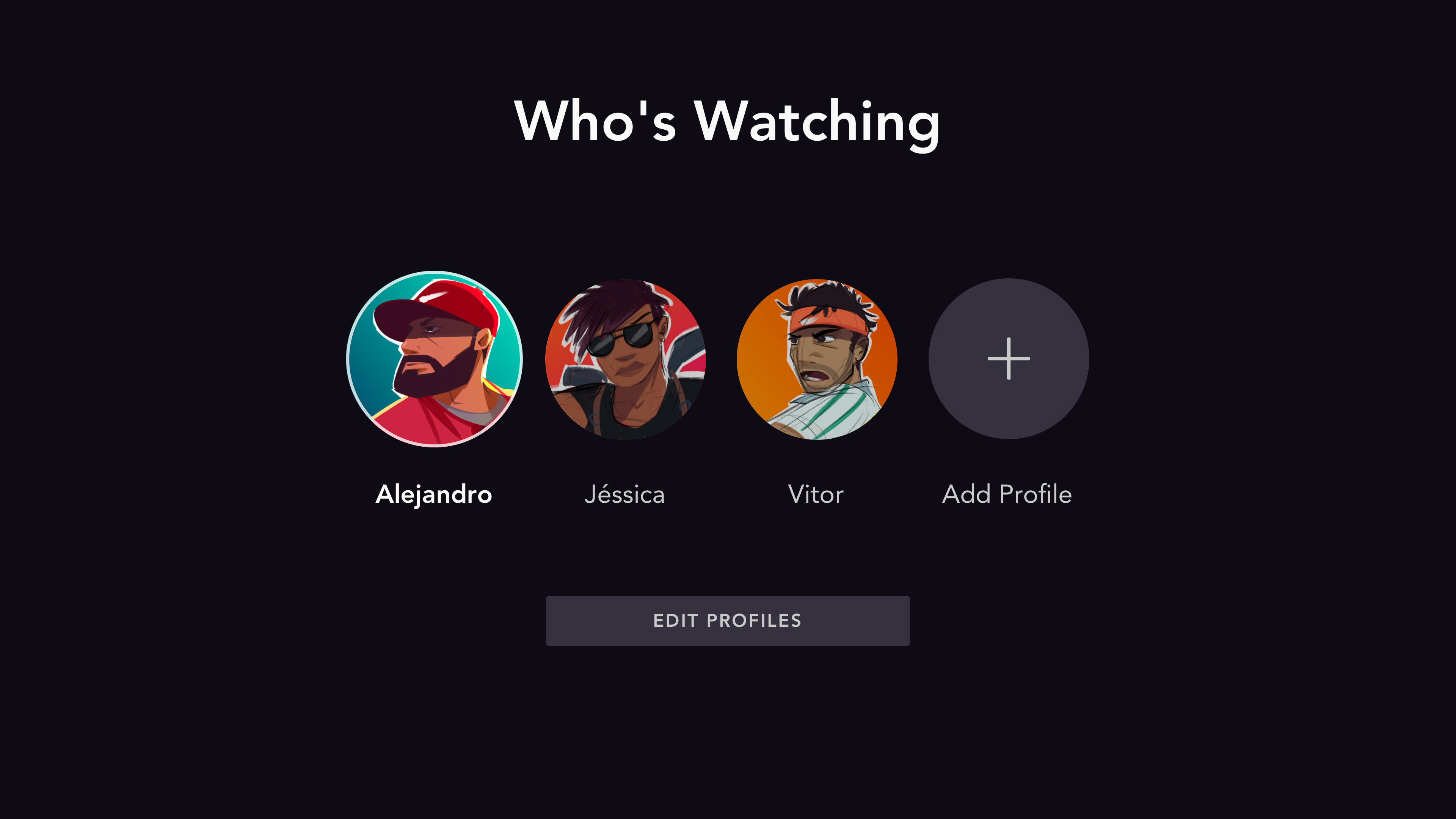
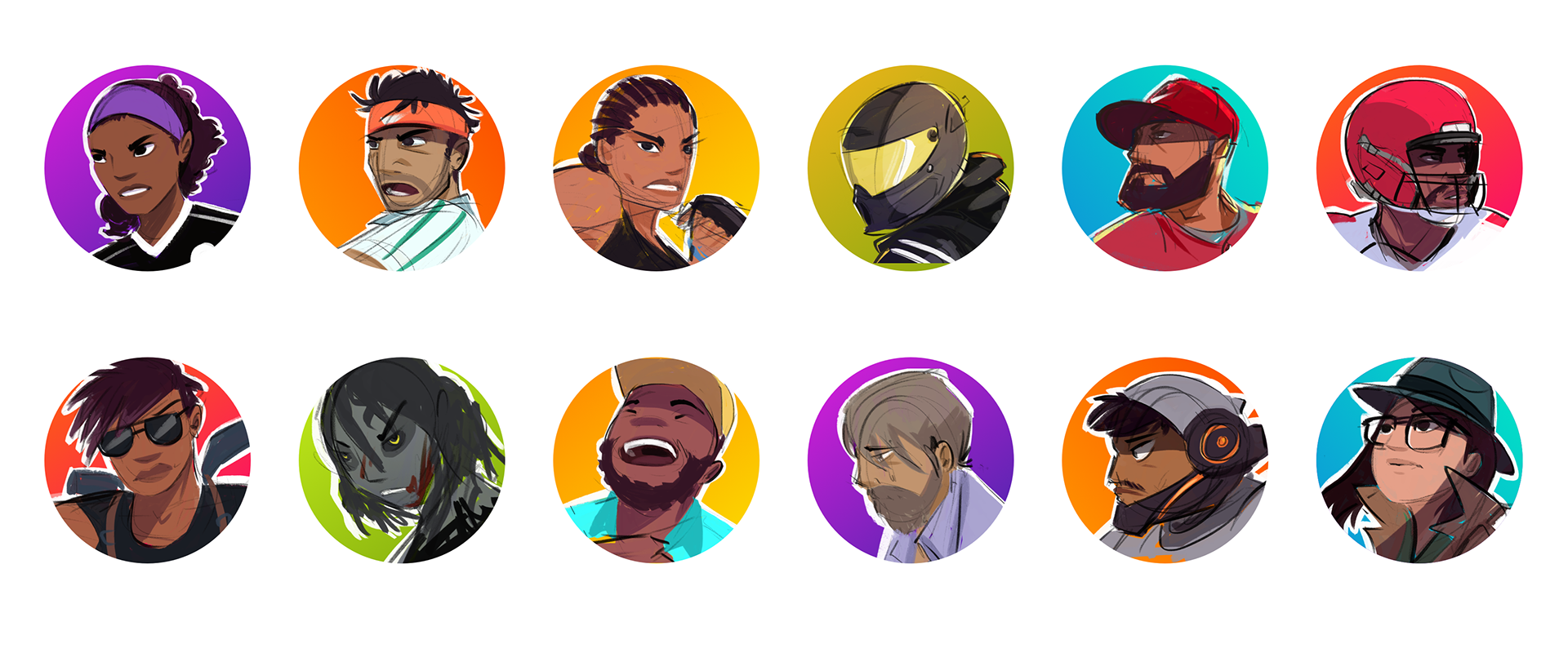
Lockup of the avatar selection screen using partially finished portrait illustrations.
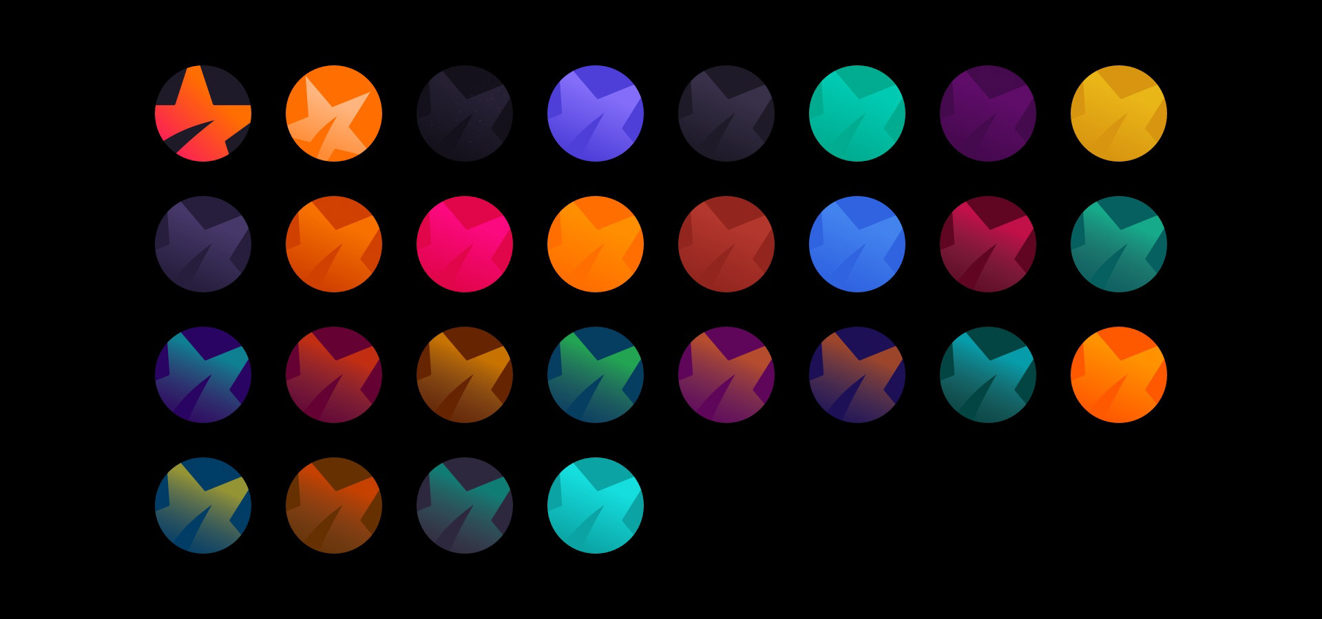
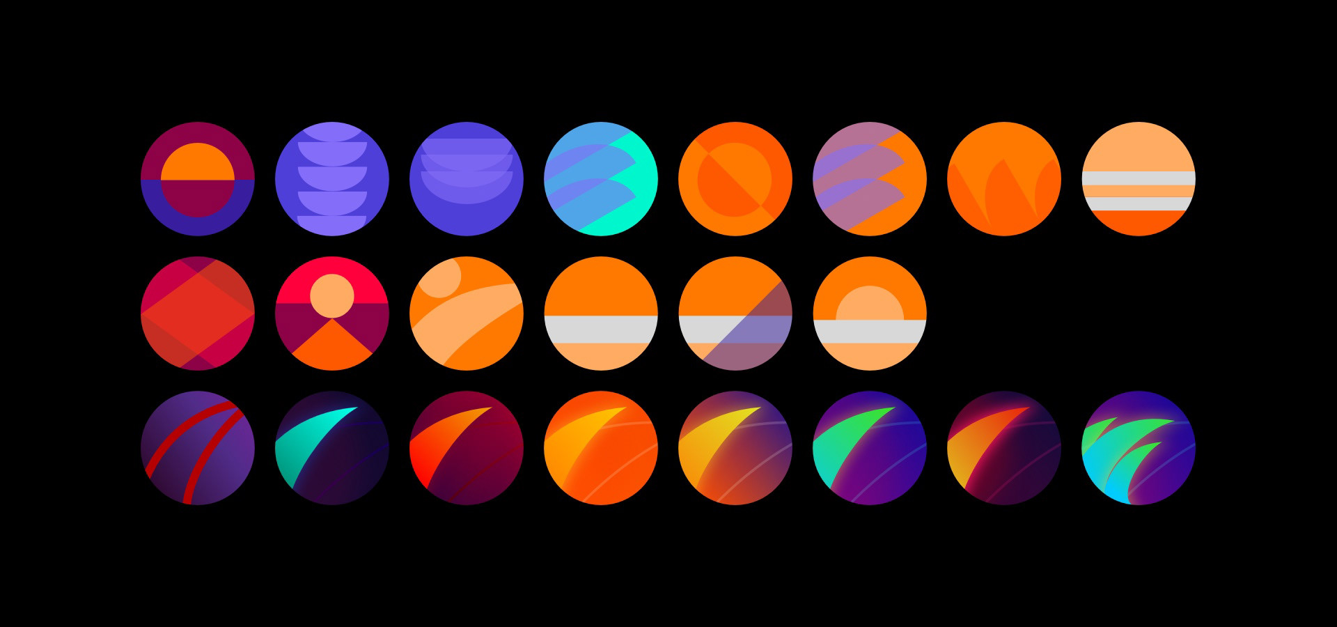
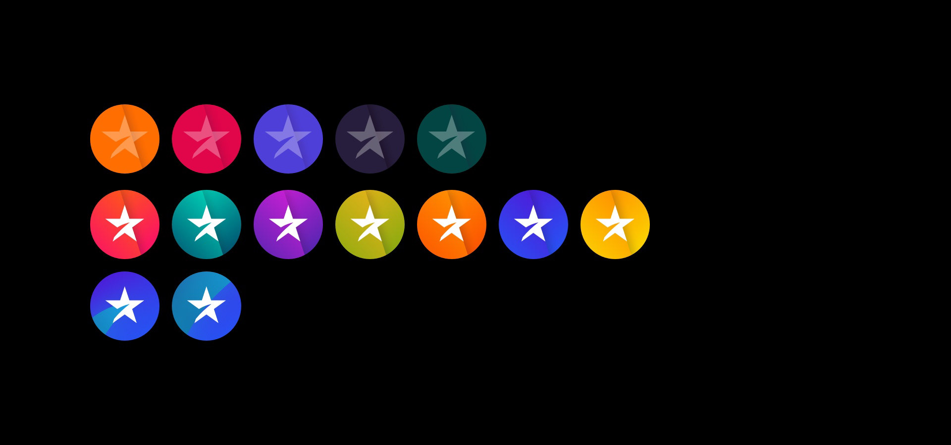
Initial explorations leaned more abstract and had a default focused appeal similar to Discord or Netflix. As the timeline was expanded, designs began to move toward literal representations of characters and objects.
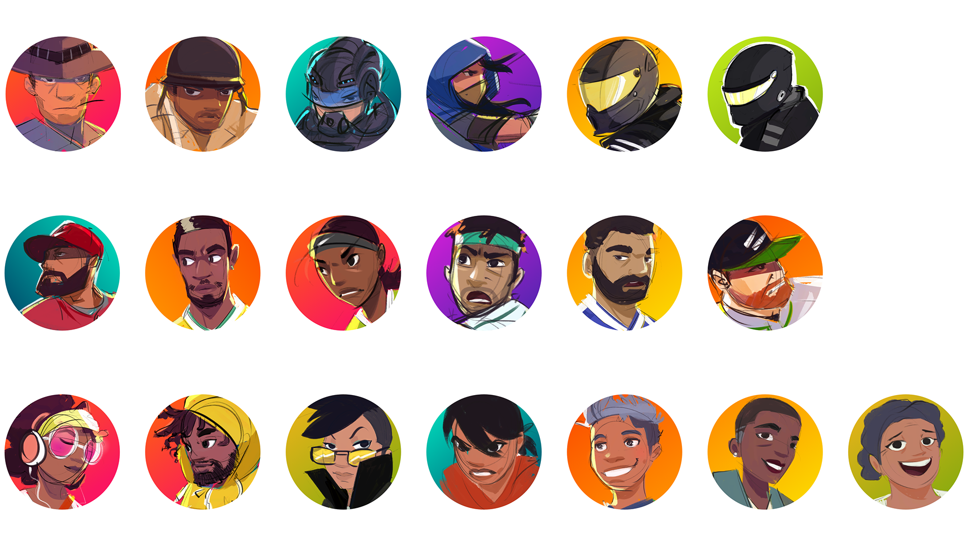
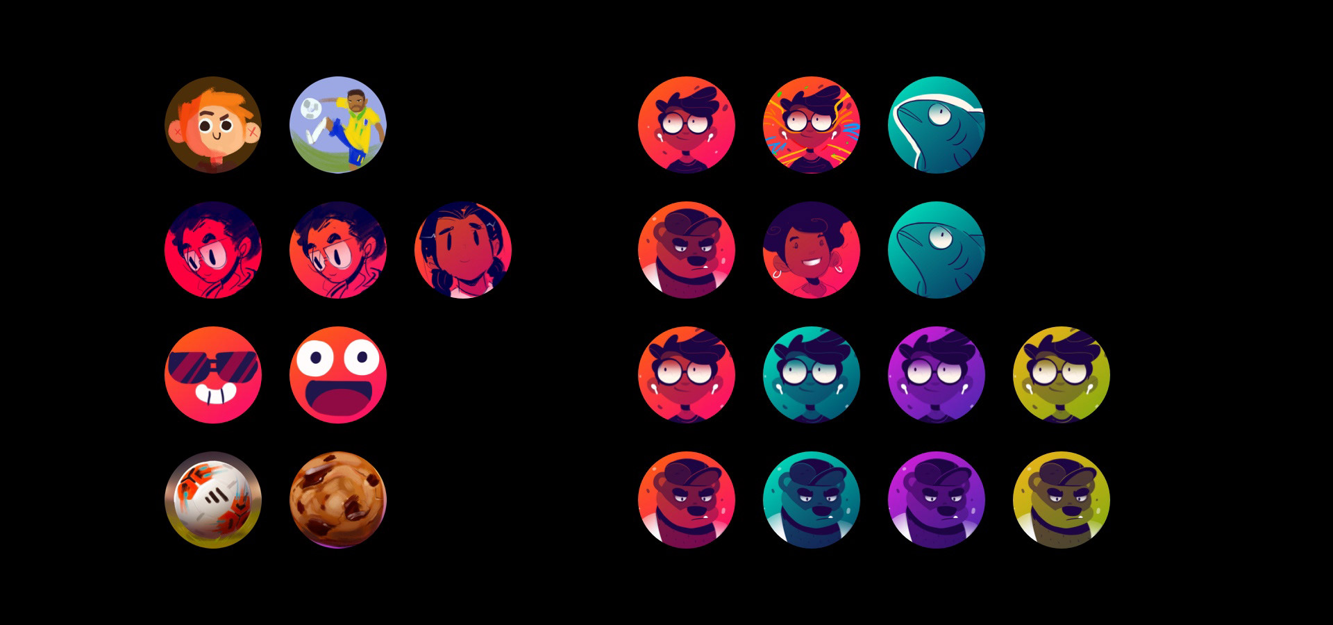
With the deadline for the initial stakeholder review fast approaching, I quickly redid all the portraits to reflect sports, movie roles, and everyday characters while pulling the bright, popsicle colors of the Star+ brand for the backgrounds.
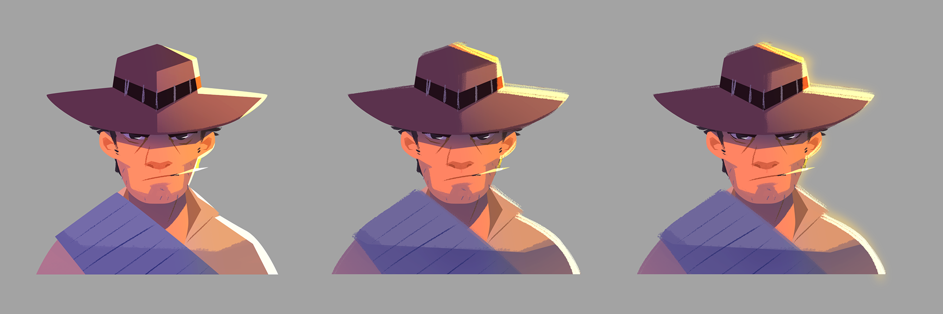
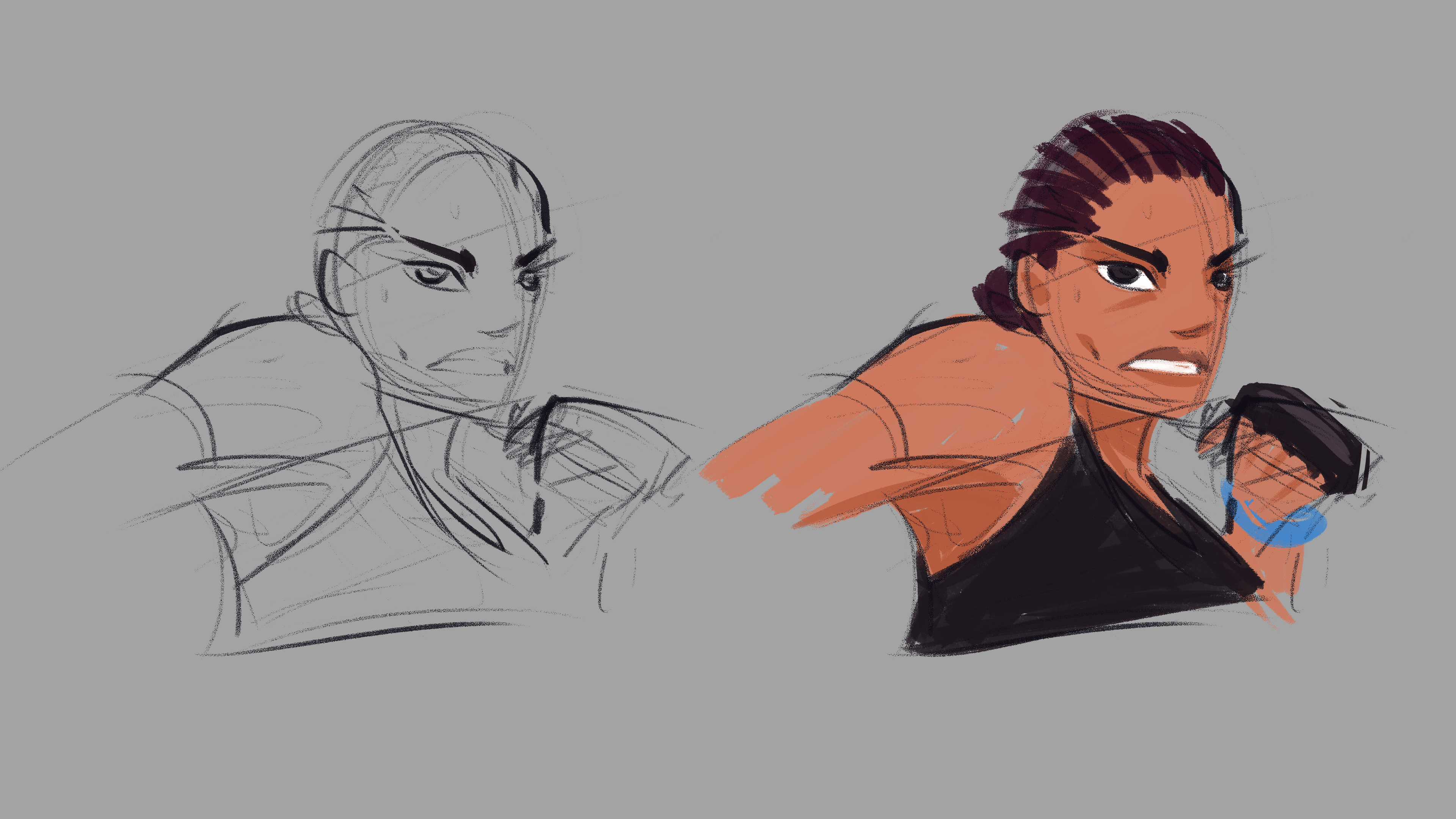
With very little time to clean up all the images before UXR tests, I made a style sample of how the character could look in a more finished quality.
From there, we decided on a list of the most popular sports and movie genres based on UXR data and made another round of sketches. I had to start over from scratch with mine, so they were rushed, but delivered on time for user testing.
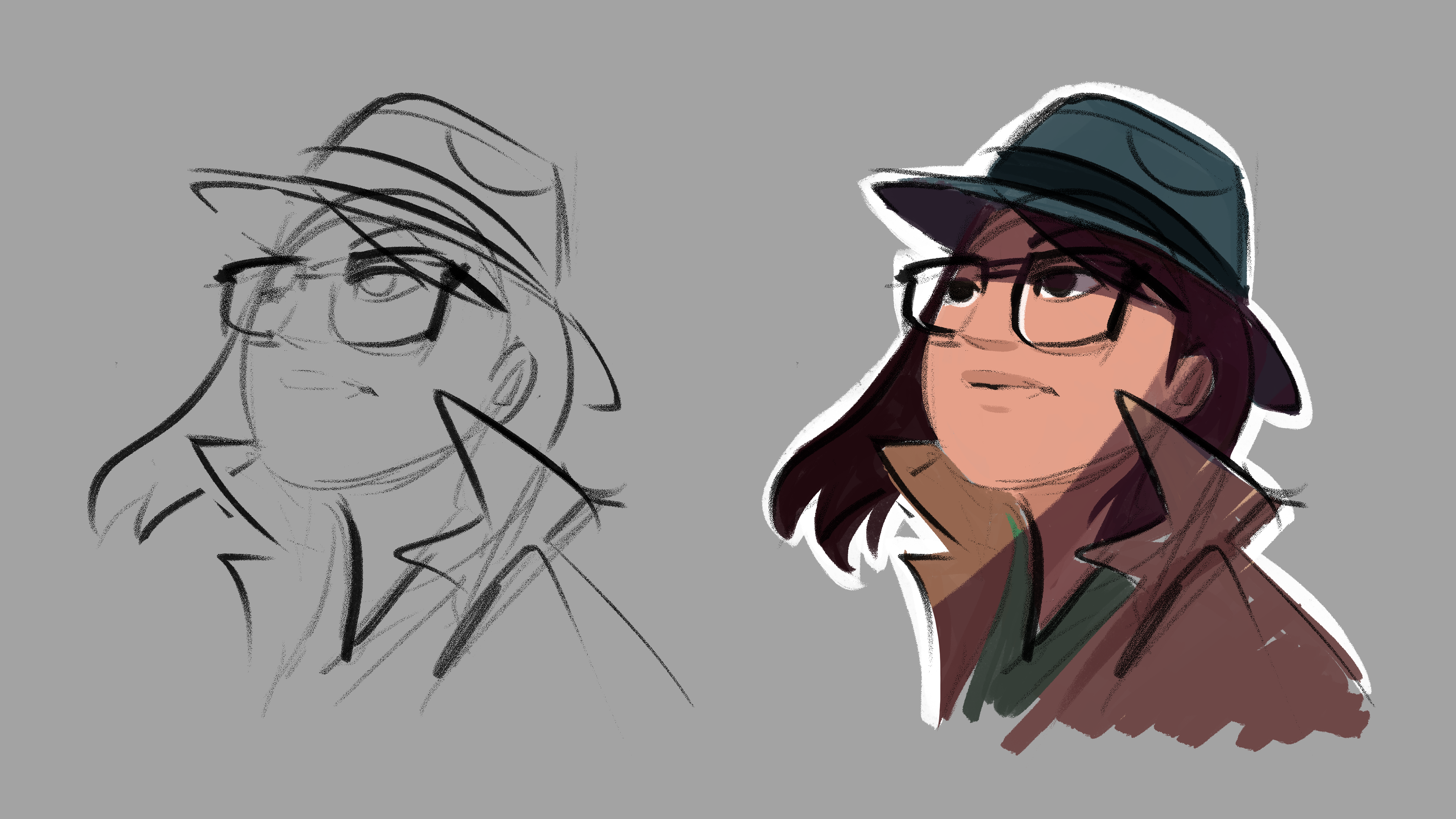
Our hypothesis was to present a very diverse set of characters with bright colors to appeal to our Latin American demographic. While the expressions, colors, and originality tested well, the diversity wasn’t addressed as well as it could be.
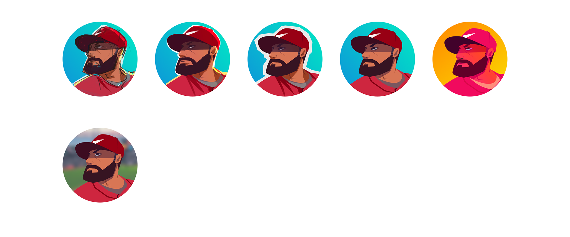
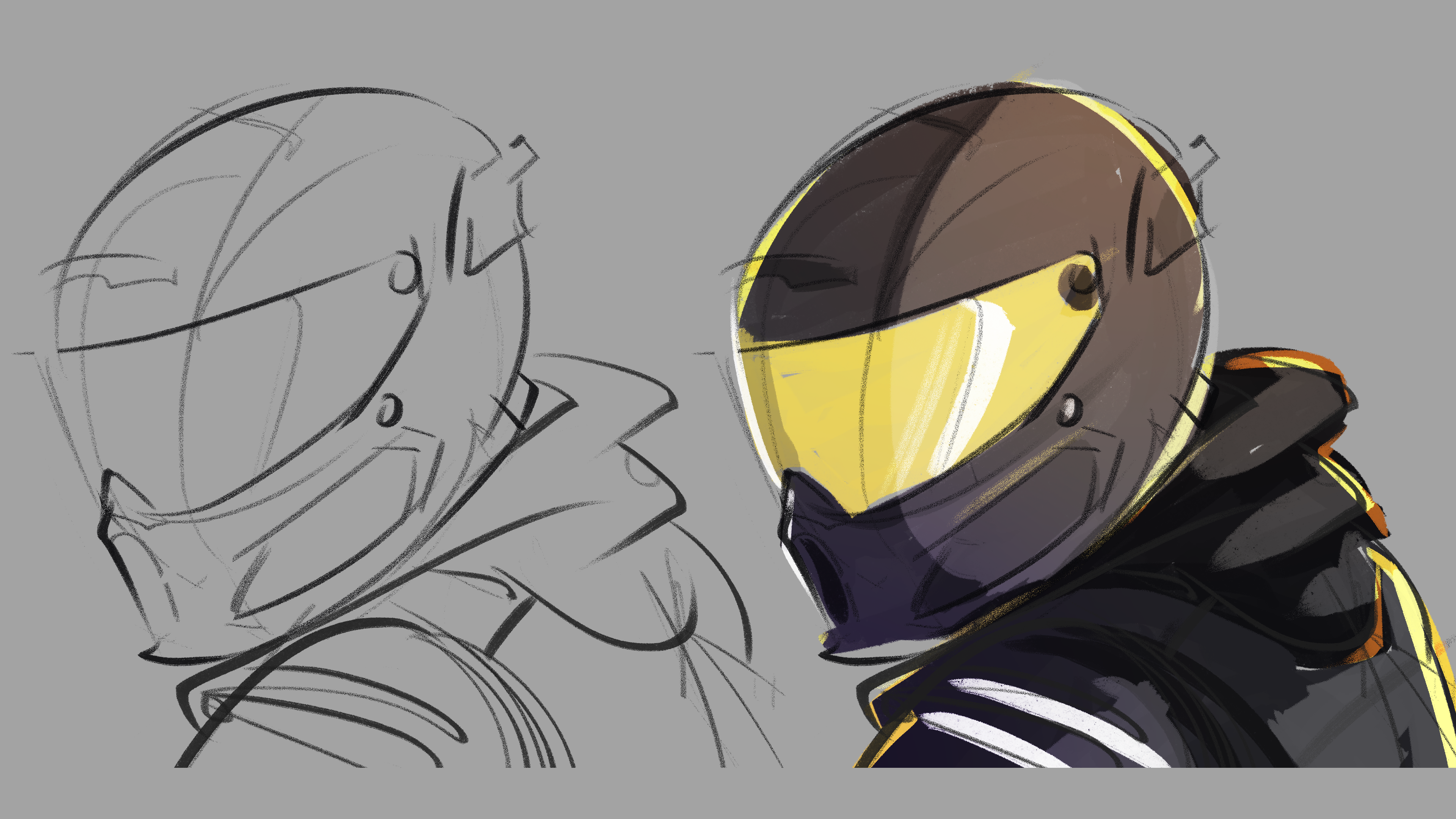
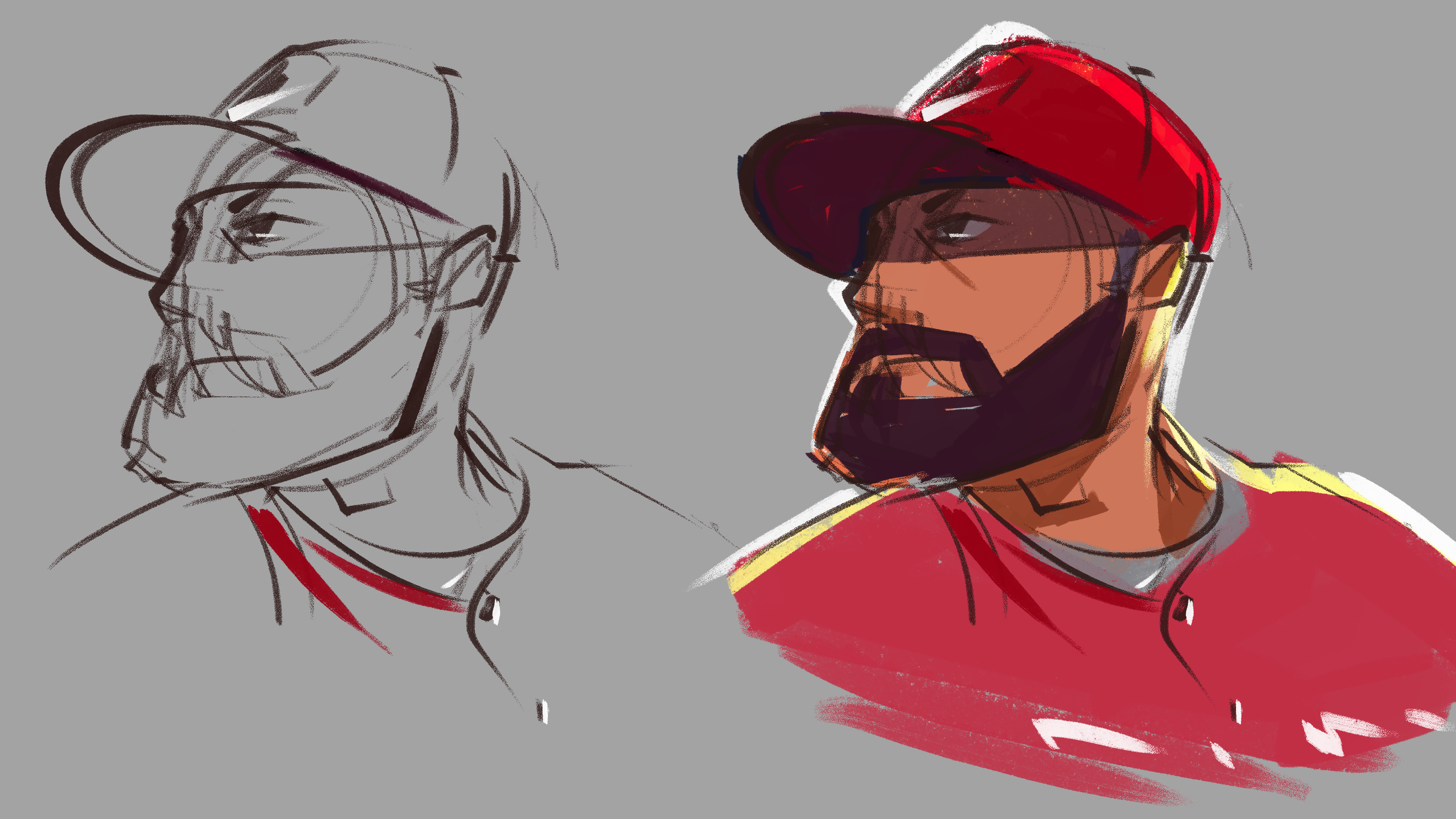
The baseball player was further along in production experimentation, and while figuring out how the finals could look, we realized that a limited palette using the hot Star+ colors helped sell the brand as well as show diversity.