
Design brief:
• New, updated layout and feel
• Emphasis on describing experience
• Include as many buy/subscribe buttons as possible
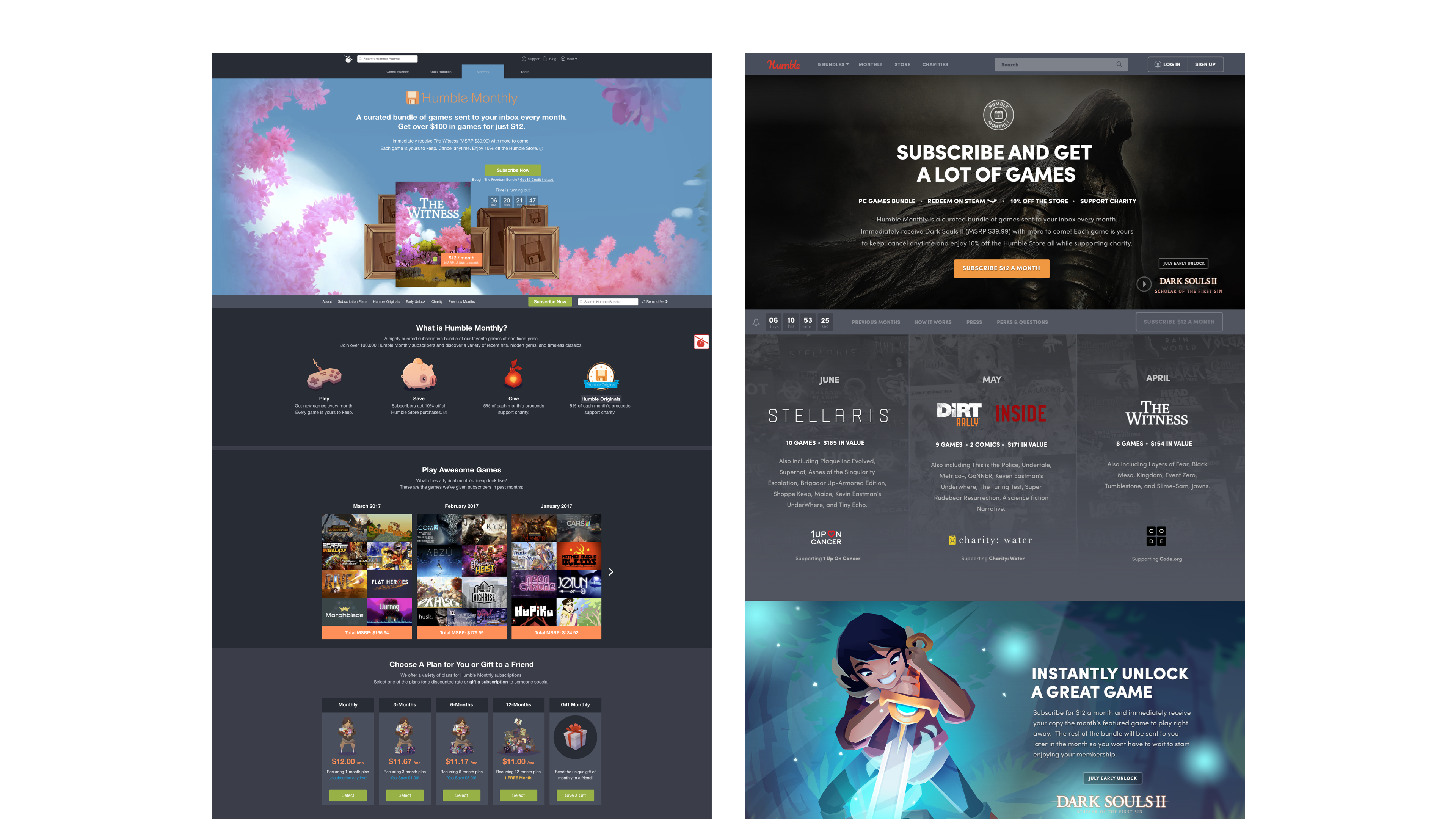
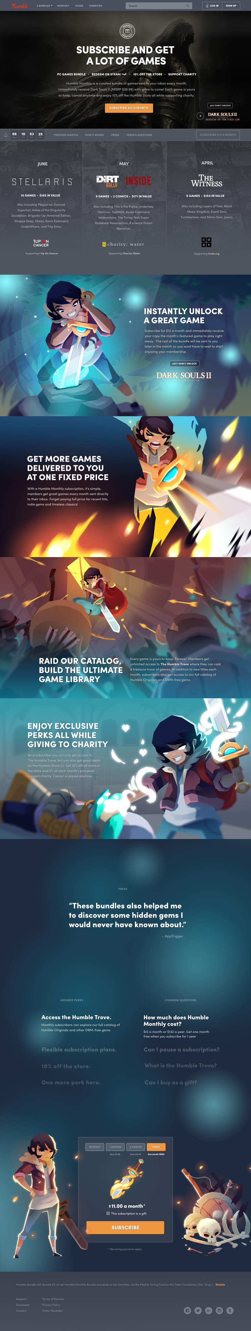
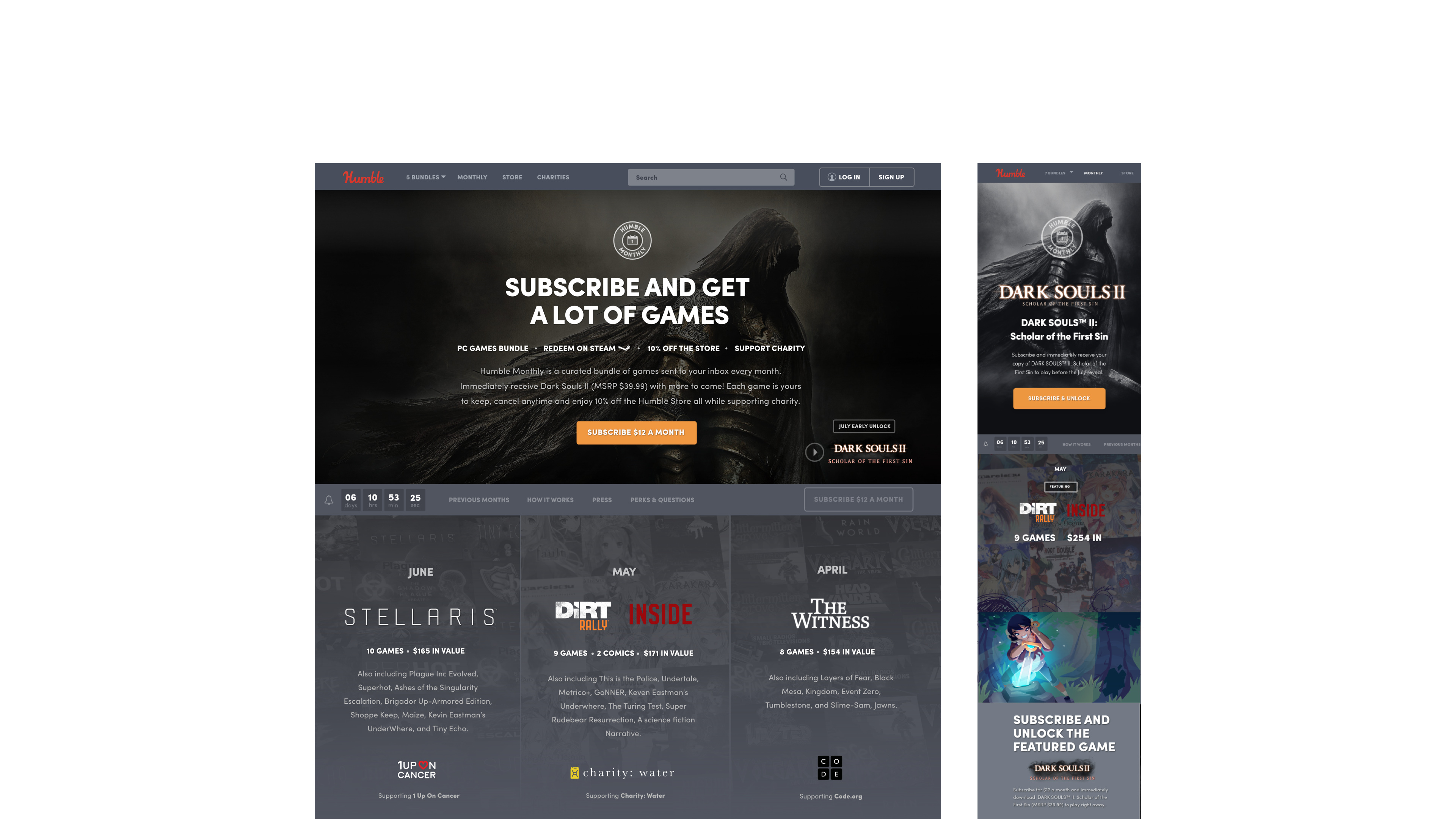
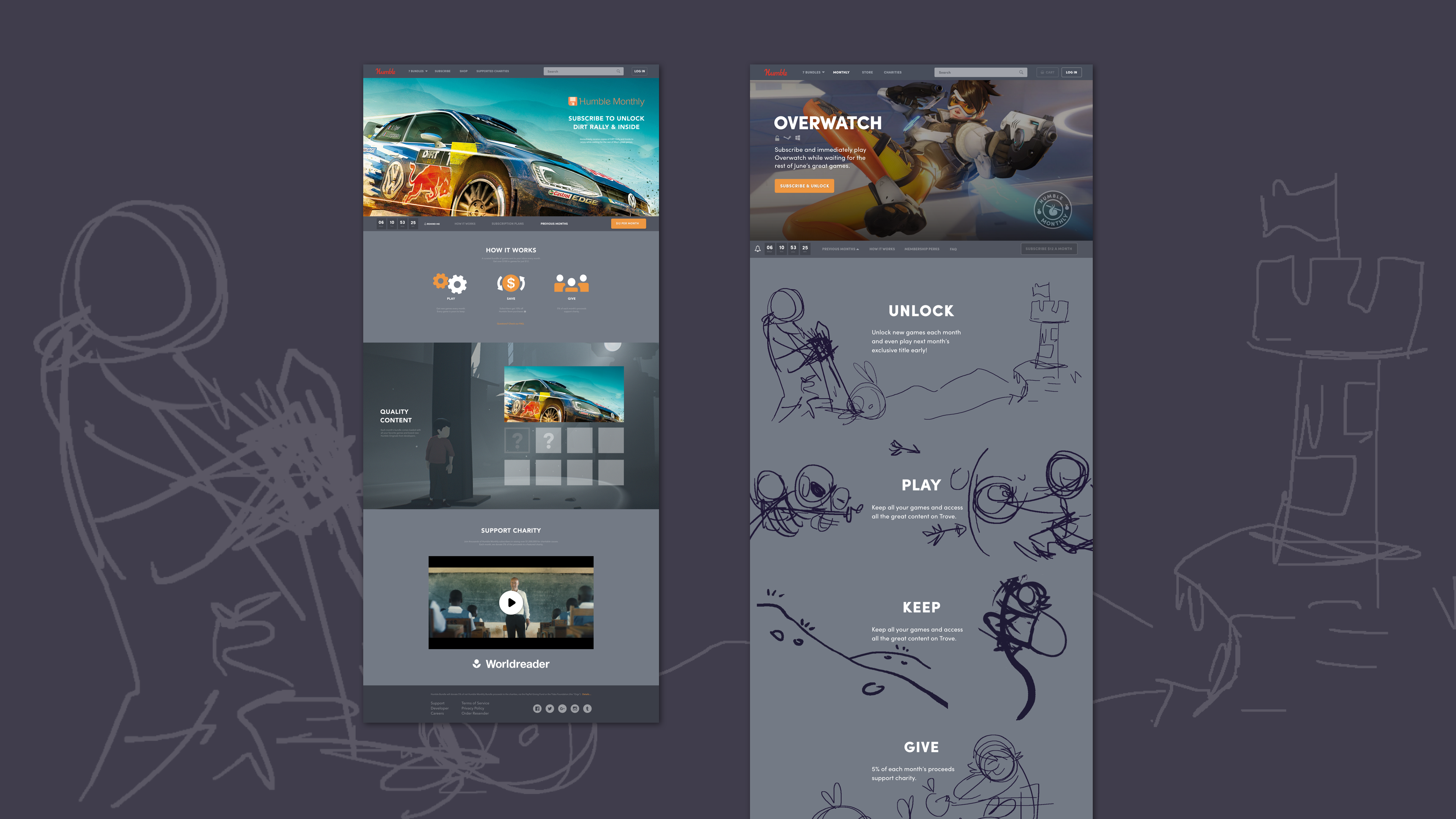
At the time, Humble was revamping a lot of the site and products - I took point on designing a new look visual for Monthly. On the left, you can see the old version, and on the right was the newer iteration the design team put together.
I started by stripping the product down to its core components. After interdepartmental discussions we added more descriptions.
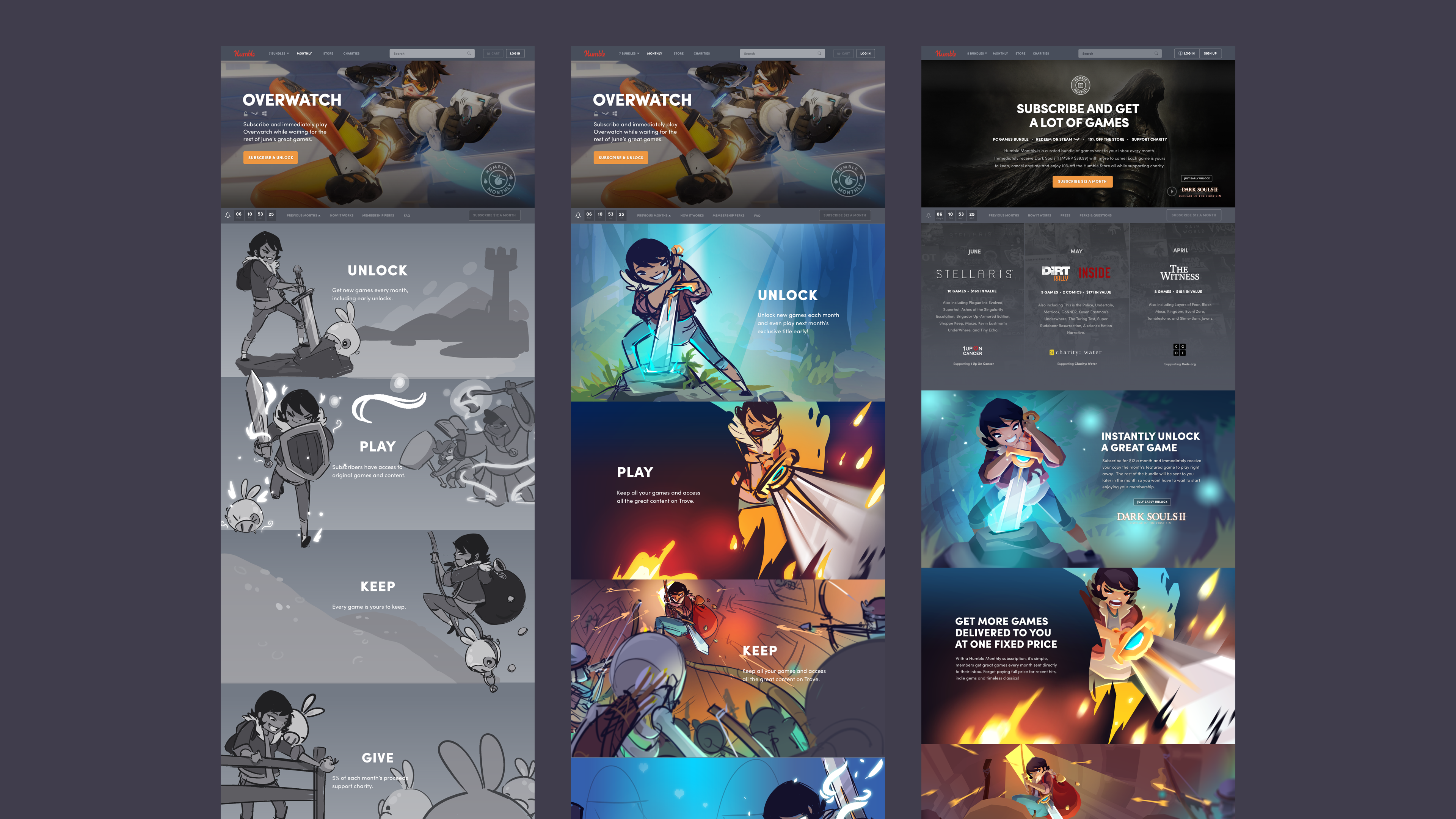
Monthly having its own original theme helped tie the product together and add something memorable for the descriptions. Having heard from our users for years, I knew they were into the narratives and recurring characters that we tried to weave into our marketing.
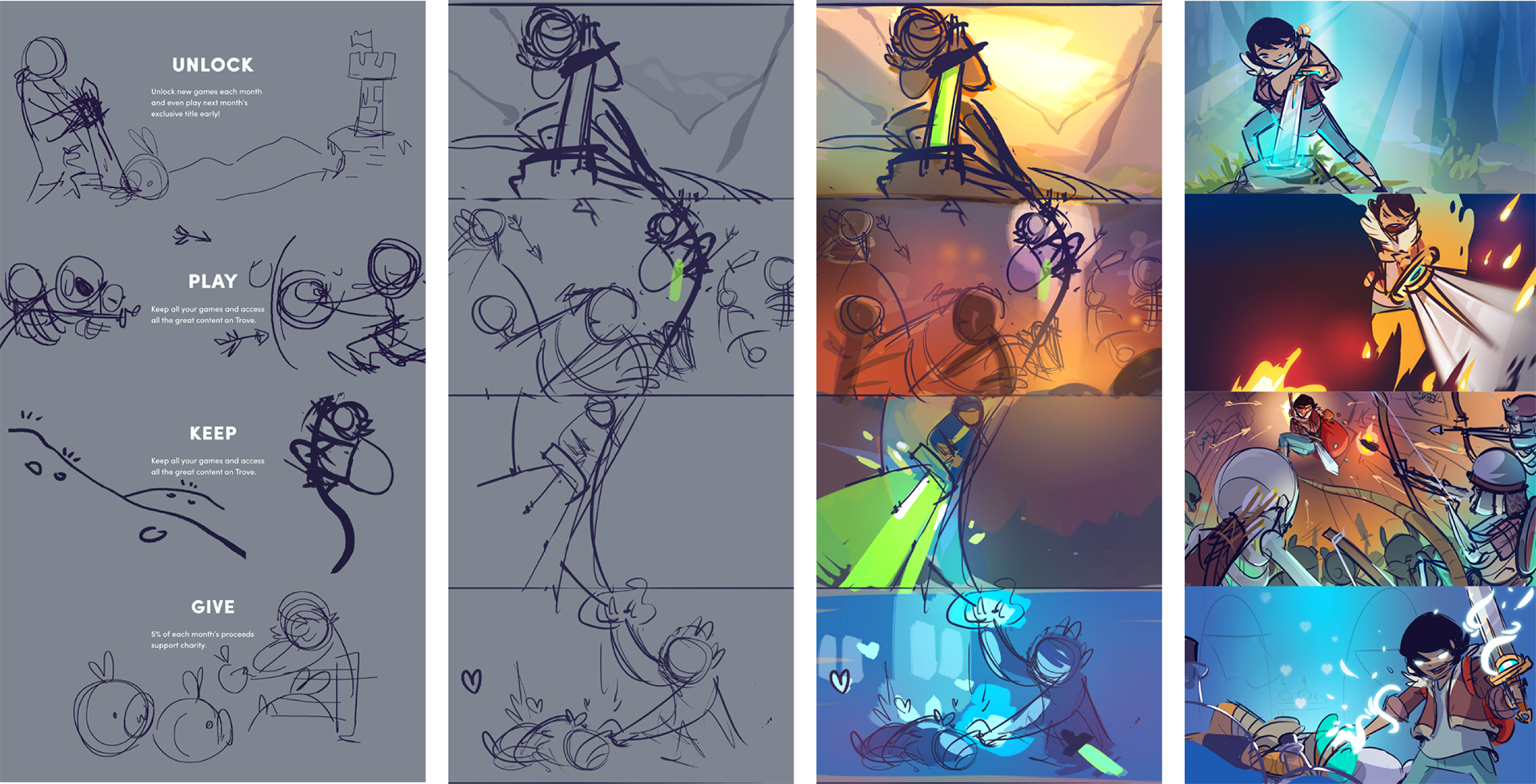
At this point, Monthly’s design was a full-blown team effort. I worked full time on the narrative visuals and gamifying the paying tiers while the director and other designer took over on other aspects.
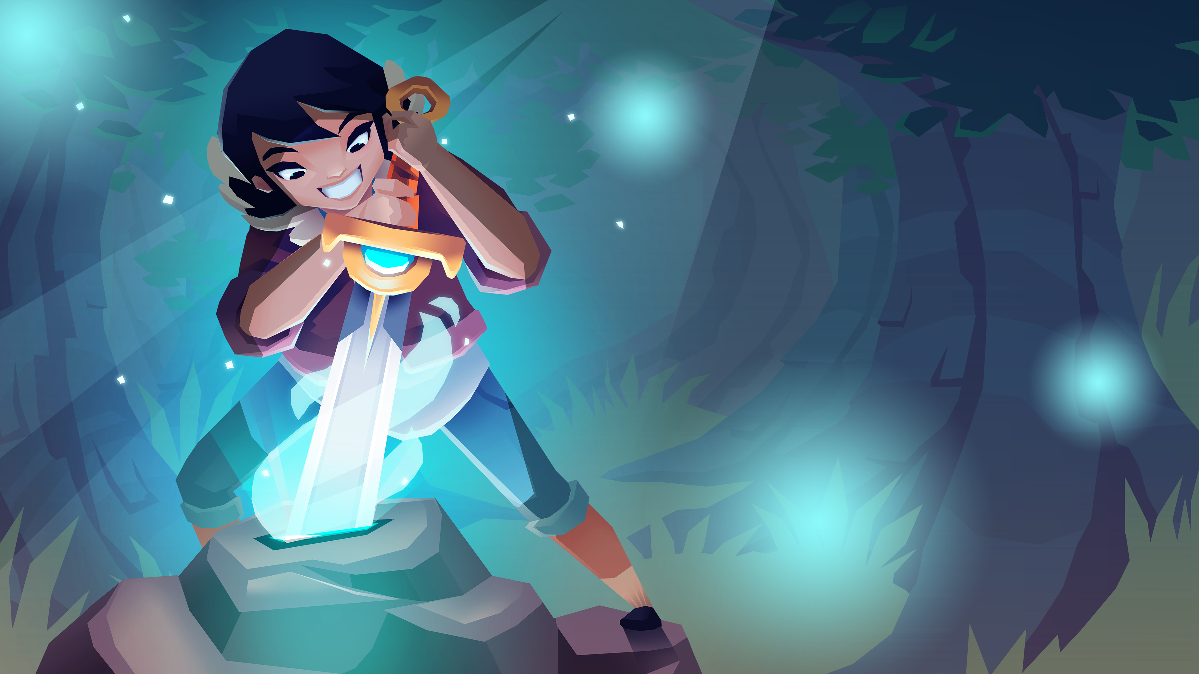
There was not a lot of time for turnaround, but the illustrations were clean and had a "sword in the stone" meets adventure narrative.
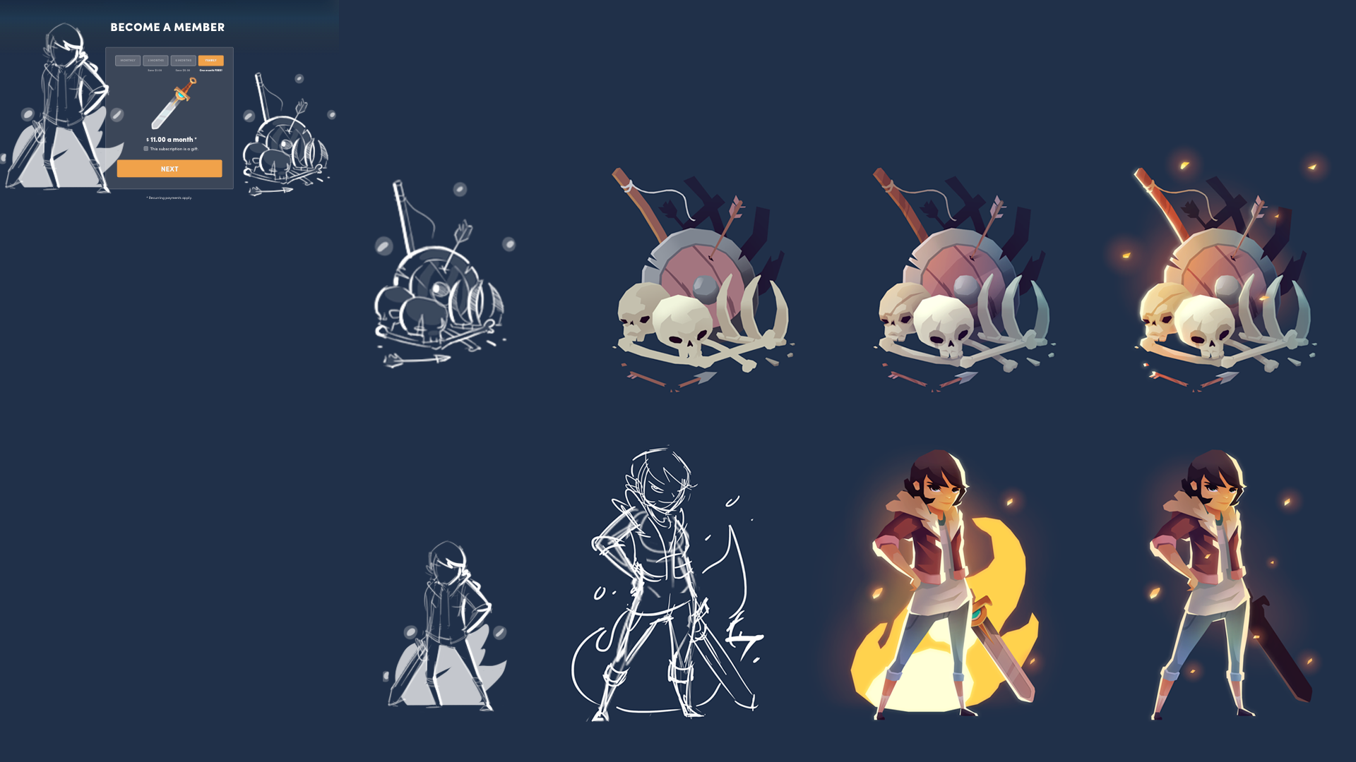
The narrative continued toward the bottom where we made different tiers of the bundle have "cooler" swords the more comprehensive the package became.
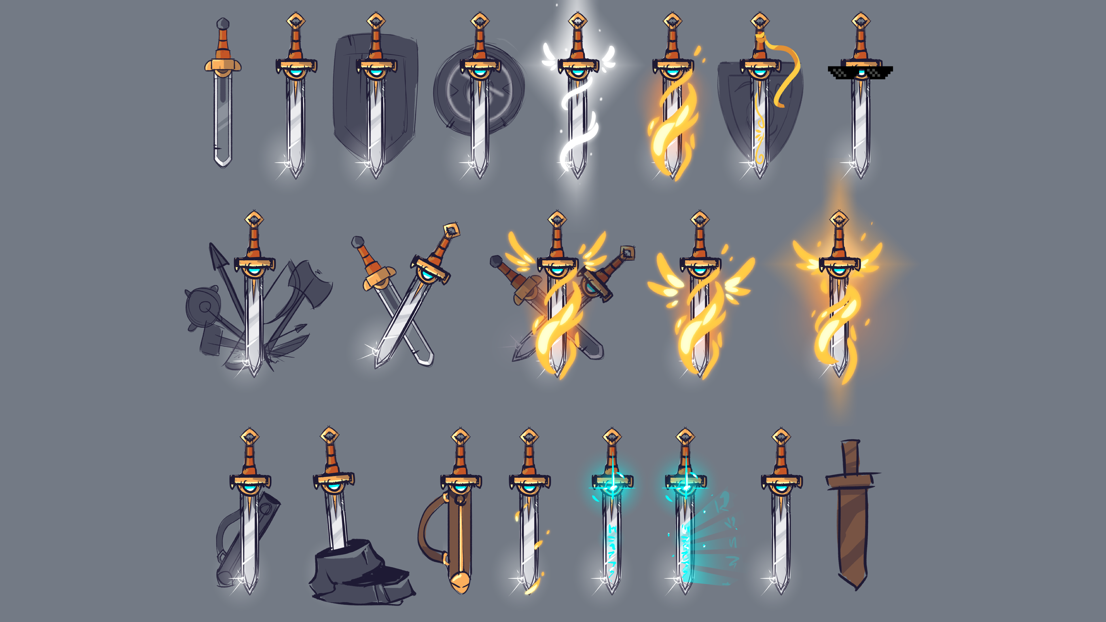
Sword bundle tier concept drawings.