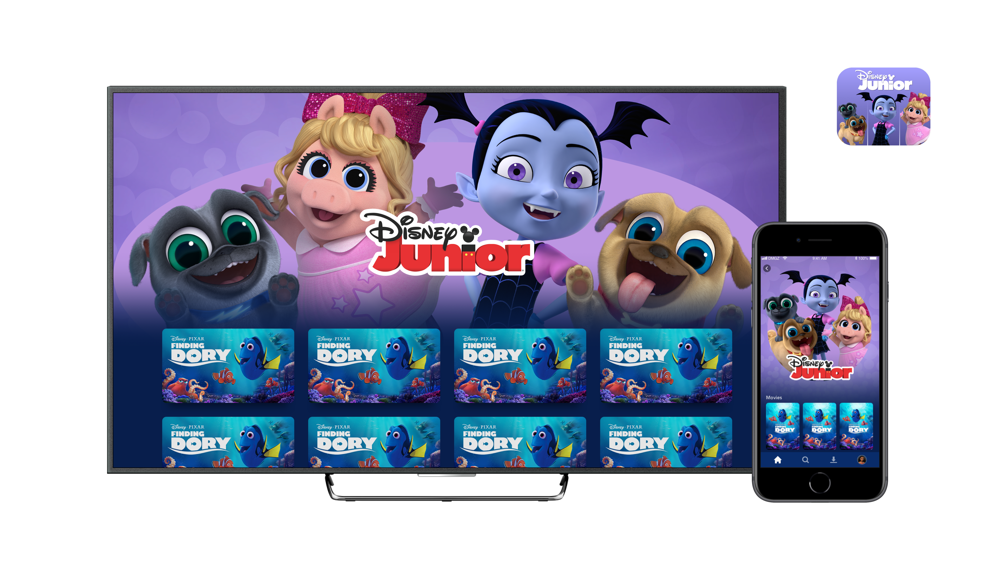
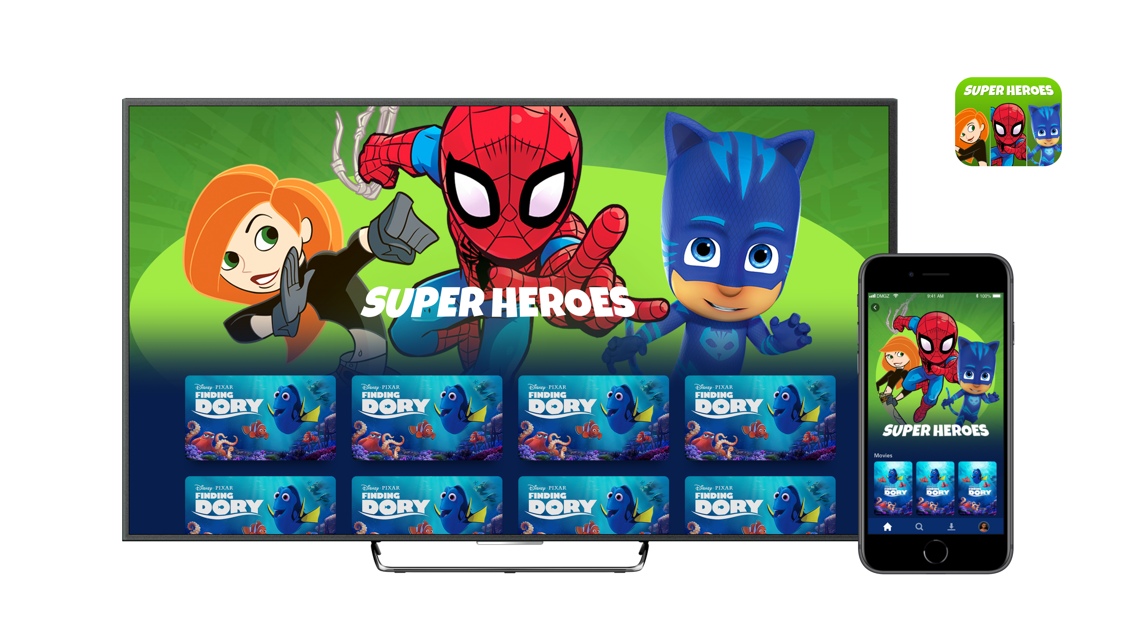
Original design leading into final version seen live today!
Original mockups of kids tiles were character based rather than collection based
Kids using this profile would be between the ages of 4-7, and their ability to read varied. We originally thought individual character portrait tiles would help them navigate to their favorite content.
The first round of UXR testing was for tablet and included single and group character versions. We found that families engaged more with tiles containing multiple characters.
These six tiles gave us the highest success rate and we were confident they covered the majority of the catalog for kids’ content
We did another round of UXR testing for CTV to see how well the navigation worked.
Nearly 100% of children were able to navigate to specific shows on their own.
Principle prototype to show how the tiles connect to their collection pages
The tiles were then updated to feature globally available characters vetted by brand managers and programming and localized into all the languages for initial launch.


Collection hero imagery for the landing screens matches their tile counterparts to reinforce navigation choices for kids.
While working through the approval process with the other departments, I wanted to see if I could make the tiles more fun and have greater clarity for children. Here are some layout sketches, partial illustration tests, and background designs to develop a uniform look with focus on appealing jewel tones and accessibility.
Each illustration was given treatment to help it sit better on the background color. Some details were streamlined to keep the art clean and digestible. Some characters’ eyes were exaggerated to draw focus.
Characters were rendered with consistent style and enhanced color contrast to unify the tile art.
I had created the characters in a setup similar to 2D puppets for games, and quickly mocked up a prototype to show how expressive the tiles could become when focused.
Final illustrated tiles. Animals and Nature was swapped back to live action animals to prevent confusing kids into thinking the content was animated.
In the end, branding was not on board and the idea was scrapped. We moved forward with the "slice" versions of the tiles.
How the final tiles look in kids' profile!

